Color, it seems so simple
Yet printing the "right" colors is difficult
We all know what yellow is and what blue is. Even most people who are color-blind can easily distinguish between different colors. Yet it is far from as simple as it seems, because blue may be blue, but how do you describe exactly which shade of blue you want? And more importantly, how do you make sure that this exact shade of blue appears correctly on your labels?
To display colors correctly, whether on your screen or in your printed work, the color must be calibrated. To ensure that the print output of Epson color label printers is optimal in terms of color accuracy, Epson offers the option in its drivers to use ICC profiles, also known as ICM.
But how do you get such a file, and how do you use it correctly? We are happy to tell you all about it here, or at least quite a lot.
✉️ Request the ICC profile for your Diamondlabels material!How do you define the right color?
HEX color codes, Pantone colors, CMYK values and RGB values
Color codes are essentially codes used to define and reproduce colors across different digital and printed media. You can think of color codes as a kind of language, where, just like spoken and written language, different languages can be used. They help designers, printers and developers achieve consistent colors, regardless of the medium they are working with. The idea behind them is to have a standardized way of describing colors so they can be displayed in the same way, regardless of the device, printer or program. The most common “color languages” are the types mentioned above.
HEX color codes
HEX stands for hexadecimal, and it is a notation used to define colors in HTML and CSS. A HEX color code consists of a hash symbol (#) followed by six characters, where each character has a value from 0 to 9 or from A to F. These characters represent the amount of red, green and blue (RGB).
For example, #FF0000 represents pure red, while #00FF00 is pure green. The advantage of HEX codes is that they are easy to understand and use in web development.
Pantone colors
Pantone is a company known for its color system, which is widely used in the graphic industry. They have an extensive collection of numbered colors that are consistent and internationally recognized. Pantone colors are often used for logos, brand identity and printed materials.
What makes Pantone colors unique is that they have their own identification number, for example Pantone 185C, which represents a bright red color. Pantone colors are mainly used in printed media.
RGB values
RGB values are a digital color coding system used to display colors on electronic displays such as computer screens, televisions and smartphones. RGB stands for red, green and blue. Each of the three colors has a value from 0 to 255.
By combining different intensities, millions of colors can be created. For example, RGB(255, 0, 0) represents pure red. RGB values are ideal for screens.
CMYK values
CMYK stands for cyan, magenta, yellow and black, and it is a color coding system mainly used in the printing industry. Unlike RGB, which works by adding light, CMYK works by absorbing light through inks on a white background.
Each color in the CMYK system is represented by a percentage. Cyan, magenta and yellow are mixed to create colors, while black (K) is added to create depth and contrast.
In summary
Using CMYK is important for printing because printed materials such as magazines, brochures and posters are usually produced using CMYK inks. By specifying colors in CMYK, designers can ensure that printed results match as closely as possible with what they see on their screen.
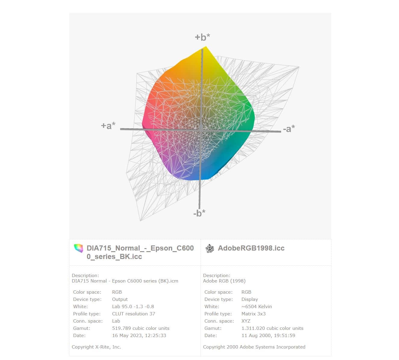
The main difference between CMYK and RGB is the color gamut. CMYK generally has a smaller range than RGB, which means that some bright and vivid colors may not be fully reproduced in the printing process. That is why it is important, when designing materials for print, to take the limitations of the CMYK color system into account.
So, to summarize briefly: HEX color codes are used for digital media such as websites, Pantone colors are used for consistency and accuracy in printed media, RGB values are used for electronic displays, and CMYK values are used for printing materials. Each color coding system has its own application and advantages, and understanding these differences can help you choose the right colors for your specific needs.
What is an ICC profile and why is it so important?
An ICC profile (International Color Consortium profile) is a file that contains information about how colors should be interpreted and displayed on different devices, such as printers, monitors and scanners. The profile contains data about color spaces, calibration settings and color transformations to achieve consistent and accurate color reproduction.
Epson ColorWorks printers support the use of ICC profiles. This additional color information ensures a print that better matches the expected color result. By using specialist equipment in advance to determine which color range is achievable within the color spectrum on the specific type of material, the printer driver knows which colors are and are not achievable, and especially how they can be achieved optimally. By knowing in advance how white the material is and how it responds to different color mixtures, the correct “color recipe” can be determined more accurately. In this way, using an ICC or ICM profile helps print the desired color on labels many times more accurately.
Without the correct ICC profile, you will not get far
A good ICC profile contains information about the combination of the ink used and how the printer media, or label material, responds to it. A good ICC profile can therefore only be created by calibrating the right material with the correct printer series. Even the print speed and/or quality is important. A good ICC profile therefore always refers to the printer, the print quality and the correct material. Through Businesslabels, customers can therefore request the required ICC profile for Diamondlabels label materials free of charge in the desired print quality.
Color intent and the differences between MacOS and Windows OS, among others
Where Apple’s MacOS only gives you the option to choose the correct ICC profile, Windows offers more possibilities to further improve colors based on the ICC profile. In Windows, you can also choose the correct input profile, meaning which color spectrum is used as input, and which intent you want to apply to the colors. This is actually surprising when you consider that MacOS is used far more often in the graphic industry for creating label designs.
In Windows, besides the ICC profile, you can choose from different color intents. Below are the most common color intents you can use with Epson ColorWorks printers. Choosing the right color intent depends on the intended use of the color profile and the desired results.
⚖️
Relative colorimetric intent
This intent tries to preserve the relative color relationships between the colors in the image. It adjusts colors to keep them within the color gamut of the output device. In other words, it preserves the overall balance of the colors, even if some colors are slightly changed to meet the limitations of the output device.
Relative colorimetric intent is often used for graphic design and web images, where preserving the overall appearance of the image is more important than absolute color accuracy.
👁️
Perceptual color intent
This intent tries to display colors in a way that matches how we perceive them with the human eye. It adjusts colors so they look natural to human vision. This intent can be useful when printing photos and images where realistic color reproduction is important.
However, it can lead to some loss of color precision or adjustment of saturation to bring the colors in line with human perception.
🎯
Absolute colorimetric intent
This intent aims for maximum color accuracy and consistency. It tries to keep the colors as close as possible to the original source colors, without any adjustments or compensations.
This is often used in professional color-critical applications such as prepress, where accuracy is very important and colors must match specific standards or references.
A common disadvantage is that transparent areas are often printed with a slight blue tint by the printer.